Maps, a window to knowledge
Interrelationship between maps and data
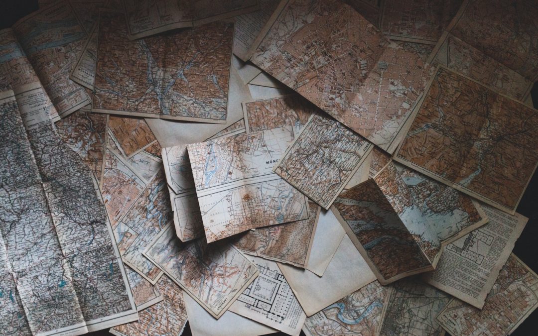
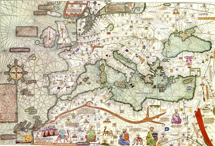
When we talk about the word map, the image of a drawing representing countries and oceans comes to mind. For the most veteran of us, maps can bring back memories of the times when we used to have those folded maps in our cars with the roads of Spain. We can even evoke those old maps, practically works of art, where the names of ports and sea towns were crammed on the coastlines, while in the waters we saw painted mermaids and sea monsters. However, we should aso think of maps as one of the most attractive and useful means of providing any kind of data that has a spatial relationship to each other.
In its simplest and most traditional concept, a map is a graphical representation that shows an measurable entity and object (e.g. road, city or even a continent) at a scale that can be represented on a physical medium (a piece of paper or a computer screen). It´s true that concepts and ideas that go beyond actual physical spaces also fall under this definition, and the distances shown by certain kinds of maps may not be something measurable, but rather that these representations show things like ideas or processes, as in the case of concept maps. However, these other types of maps are further away from the concept addressed in this post, where we will focus on the more classical definition, but without renouncing the advantages provided by modern technology (in this case, the most recent programming languages).
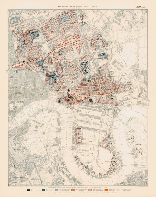
In cartography, maps are used to represent geographical entities in different locations considering different representation systems. These entities, in addition to their geometry, can include distances, altitudes, and a long list of attributes that help to improve their representation. However, over time, maps have been used to represent characteristics or attributes of the elements, statically or dynamically through their spatial relationship with a geolocated entity. As an example, we could put a map of the people living in a certain region (population density), or of the voters of a political party, or of the per capita income of the cities represented.
The data we refer to are ultimately qualities or values that are relate spatially or not to the elements represented on a map. Therefore, we can speak of data represented on a map, although the reality is that it is the whole that serves the intended purpose: the data have meaning not only in their numerical value, as we have in the case of a simple list of data, but also in their positional value, where the relative position of those data on the map is what gives them sense and meaning, not only to themselves, but to the whole.
Practical use of data in maps
One of the technological fields where it is necessary to work with data and their relationships between them is the programming of software oriented to data visualisation. Without departing from the classic concept of map, it is of great importance to use these tools so that the users of the software (or the people who visit the website) can have the data available, in a clear and accesible way, and above all, so that at a glance they can get an idea of the set of data is being displayed at the moment.
There are a number of design tools for implementing interactive maps in both desktop and web applications. The most popular of these are, on the one hand, interfaces that bridge to existing desktop applications (e.g. applications using ArcGIS modules), and on the other hand, libraries for handling embedded maps in popular programming language applications, such as the Leaflet library.
The Leaflet library was launches in 2011 by the Ukrainian Volodymyr Agafonkin. This library is designed to work with JavaScript, and shows its usefulness in web applications for both computers and mobile devices, thanks to its small size (42 KB) and its good implementation, which makes it really easu to use from sides of the application, both by the user who browses the map, and by the programmer who writes the code that allows the map to do what its needed.
In addition to the above and considering the programming of interactive interfaces, it is important to have a library that allows not only to work with Leaflet, but also to use compatible components and help to integrate the whole set in a practical and easy to program application. In this case, the most popular and widely used library is React. And working with React, the best way to use Leaflet is through the integrated react-leaflet library, which will allow us to use each and every one of the features of this library, using the way React itself works.
This way of working with React, to give a brief outline, requires interacting with the objects in the code either through functions or using the concept of classes, understood in a similar way to that used in what is known as object-oriented programming. And this is how Leaflet works, highlighting the use of two concepts called the view and layers:
- The view is the maps´s own sub-interface, which in turn contains all the uses and functionalities. For example, we could have buttons to show and hide data layers, zoom and search the map, and so on.
- Layers are objects that contain the link to a specific dataset, as well as functions and properties that belong to the layer.
A view can therefore have several layers, which are the layers that contain all the data shown on the map. The map has one or more data layers, which show the information superimposed on the corresponding base layer.
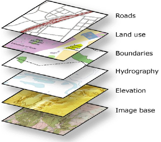
To understand this concept a littele, a simple image of something that could be equivalent to this idea is the use of “transparencies” ( or “acetates”), which were used in the past to show slides: imagining an opaque sheet where a map is drawn, on it we can superimpose those transparent sheets, where our data is painted, in the form of polygons, marks, icons, arrows,etc. We can even superimpose several of these sheets, and we would see the data on top of each other, but all of them on the lines of the fixed map. The fixed map would be what we called before “base layer”, and the acetates would be acetates mentioned will be the data layers.

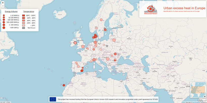
From CARTIF, we work on the implementation of solutions that use these technologies for the visualisation of geolocated data. As an example, we should highlight the ReUseHeat and ePARCERO projects, where two applications have been developed for the management of geolocalised data. In ReUseHeat, the statistical visualiser allows to observe the sources of unused heat in hospitals, waste treatment centres, data centres and underground passenger transport. The base layer of the map belongs to OpenStreetMaps, and the data on potentially usable energy has been obtained from surveys carried out within the project. An interesting detail of the visualiser is to see how visualised objects are grouped into bubbles, which are broken down by zooming in on specific areas, improving the visualisation of the dataset. And all this is achieved through the use of Leaflet.
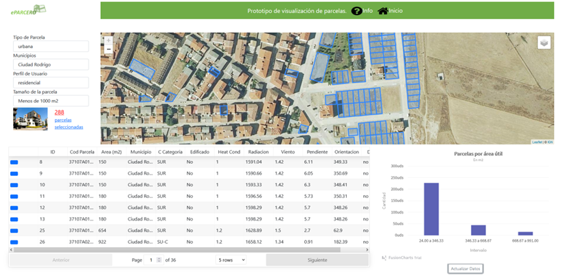
In the case of the ePARCERO project, whose prototype visualisation is still pending publication, the map is only one part of the tool, although it is the most important one. The map, which is coordinated with the data table at the bottom of the screen, as well as with filters on the left, shows the parcels selected as candidates of interest for users looking for parcels with certain characteristics, and which are currently not in use. The map allows to switch between two base layers, one the classic OpenStreetMaps one, and the other with the ortho-photo of the National Geographic Institute. As added details, apart from the pop-ups of the data when you click on one of them, the map auto positions itself when you choose a locality and makes the corresponding auto-zoom.
Present and future of interactive maps
As we have seen in the two previous cases, the usefulness that this type of tool has when displaying information on the screen is appreciable, going beyond the traditional visualisations in which the maps on web pages were only a pre-generated image, or that had to be generated each time data was modfied. Now, maps generated using Leaflet change, adapt, and are a dynamic tool on which to look at various data sets, and always serve the needs of a user who receives visual information that maximises its usefulness in this way. Most importantly, it allows the user to have no knowledge of maps, just a computer mouse and the curiosity to discover the data offered from the interface.
The future prospects for this technology offer new levels of detail in maps and new media to visualise plans and maps in three dimensions, beyond flat screens, allowing direct interactions with the represented element, as can be seen in the gradually more widespread use of virtual reality devices. But for the time being, the visualisation technology used more than meets expectations and proves its usefulness for the general public. From the Energy Division, we hope to make it as easy as possible for users to select and check data in increasingly comfortable and user-friendly interfaces.
Agreements to Susana Martín and Iván Ramos, from the Energy Division, for its comments and technical annotations in the present article.